
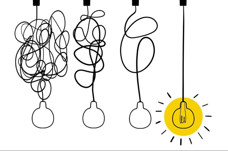
When I first heard the term “Product Design Process,” I imagined some neat, linear path you follow to design an aesthetically pleasing app on Figma but now I understand that it’s a lot more. The process is more like Lagos traffic, messy and full of unexpected turns. It is not linear, can even be chaotic sometimes, but I have realized that the chaos has a method.
So, let me walk you through what the product design process really looks like, especially from the eyes of a wide-eyed intern.
1. Understanding the Problem
Before I touch Figma, I’ve learned to ask a lot of questions. Because if you don’t understand the why, you’ll end up designing screens that look great but solve nothing. And trust me, there’s nothing wrong with asking questions. A simple ‘please, what are we designing’ could save you a lot of time and headaches.
Ask questions about the problem you are trying to solve and then find answers to these questions. This way, you are sure you are actually solving a problem that needs to be fixed, not just designing based on vibes.
ALSO READ; [GUEST POST] A Week in the Life of a Product Design Intern
For example, you were asked to “ improve users’ onboarding flow.” Ask;
- Why are users dropping off?
- Where do they get stuck?
- What does success look like?
This part is all about research and clarity. It often involves:
- Talking to users
- Studying user behaviour via analytics
- Reviewing business goals
2. User Research
Always remember that you are not the user. I used to think I could guess what users wanted. Big mistake. Even bigger when the actual users are a very different demographic from you. Try to understand the user. Research your users’ behavioural patterns, culture, the product they enjoy using, and even their computer literacy. Research is the deep-dive stage. Think user interviews, competitor analysis, surveys, and some good old social media sleuthing. This stage taught me that empathy is everything. If you don’t listen to your users, you will most likely design a product they won’t use.
3. Ideation
My favourite part… brainstorming solutions. At this point, no idea is wrong, and that’s the beauty of it. When I just started my internship, I used to be scared to share ideas. But, I quickly learned that even “dumb” ideas can spark something valuable. I sketch (on paper or Whimsical), consider different layouts with my supervisor, imagine features, and finally narrow down what actually makes sense to design.
4. Wireframing (Where You Resist the Urge to Add Colour)
Designing low-fidelity screens used to be tough for me. I’m a visual person, so I always want to jump into high-fidelity screens. But wireframes force you to think function over form. A book I read (Refactoring UI by Adam Wathan and Steve Schoger) says, “hold the colour, by designing in greyscale, you’re forced to use spacing, contrast and size to do all the heavy lifting” therefore, colours just act as a support.
I learned to:
- Focus on content hierarchy
- Test multiple layouts quickly
5. High-Fidelity Design and Prototype
Finally, let’s make it pretty! Here, I apply the design system (to make designing easier, make your design system ahead if none was provided), make buttons feel clickable, add icons, colours, and spacing. And seeing your idea go from a sketch to a clickable prototype? Absolute serotonin boost.
But, I also learned it’s not just about beauty. Accessibility, consistency, and usability matter. Every colour, icon, and line spacing needs to be intentional.
6. Testing

Usability testing is humbling. You watch users struggle with things you thought were obvious. But, testing taught me to always test with real users (even one is better than none), observe users when they interact with your design. Don’t explain; user feedback should always override your feelings.
7. Iteration
After testing, I go back to revise. Maybe the font was too small. Maybe the CTA needs a better colour. This step often loops multiple times.
Finally, we handed off designs to the devs. But guess what? Even that’s a process. You need:
- Well-labelled Figma files
- Prototypes or screen flows
- Notes explaining interactions
The product design process is more than just a checklist of steps; it’s a mindset. It’s about empathy, creativity, and a dash of chaos. I’m learning to trust the process, embrace feedback (even when it stings), and enjoy the tiny wins. If you read this far, you should join Tech Community for more educational content like this.
Next week, I might talk about impostor syndrome and how I’ve considered googling “How to quit tech and raise chickens.” But for now, I’m staying curious, caffeinated, and determined.
Stay tuned.


1,672 Responses
Canlı casino oynamak isteyenler için rehber niteliğinde bir site: en iyi casino siteleri Hangi site güvenilir diye düşünmeyin. Editörlerimizin seçtiği bahis siteleri listesi ile sorunsuz oynayın. Detaylar linkte.
Hər vaxtınız xeyir, siz də etibarlı kazino axtarırsınızsa, məsləhətdir ki, Pin Up saytını yoxlayasınız. Ən yaxşı slotlar və rahat pul çıxarışı burada mövcuddur. Qeydiyyatdan keçin və ilk depozit bonusunu götürün. Oynamaq üçün link: https://pinupaz.jp.net/# ətraflı məlumat uğurlar hər kəsə!
Hi all, Lately discovered a great website to save on Rx. If you want to buy medicines from India safely, this site is the best place. It has fast shipping guaranteed. Take a look: indian pharmacy. Hope it helps.
Hi all, Just now found a great source from India for cheap meds. If you need medicines from India without prescription, this site is highly recommended. They offer secure delivery to USA. Visit here: https://indiapharm.in.net/#. Good luck.
Hey guys, Just now discovered the best website to save on Rx. If you need ED meds at factory prices, this site is highly recommended. It has lowest prices worldwide. Check it out: https://indiapharm.in.net/#. Good luck.
Hey there, I just found a trusted online source for cheap meds. If you are tired of high prices and want meds from Mexico, this site is highly recommended. Fast shipping and it is safe. Check it out: visit website. Sincerely.
To be honest, I recently discovered the best source from India for affordable pills. If you want to buy medicines from India without prescription, this site is the best place. You get wholesale rates to USA. More info here: India Pharm Store. Cheers.
Greetings, Just now found an awesome Mexican pharmacy to save on Rx. If you want to save money and need affordable prescriptions, this store is worth checking out. Fast shipping plus it is safe. Link is here: read more. Thx.
Greetings, I recently stumbled upon an amazing source from India for affordable pills. If you need medicines from India cheaply, this store is worth checking. It has secure delivery to USA. Take a look: indian pharmacy online. Hope it helps.
Hello everyone, Lately came across a great website to buy medication. If you are tired of high prices and need meds from Mexico, this store is a game changer. Fast shipping plus secure. Take a look: read more. Peace.
Hello everyone, I recently found a great resource for affordable pills. If you want to save money and need meds from Mexico, this site is worth checking out. Fast shipping plus it is safe. Check it out: mexican pharmacy online. Appreciate it.
To be honest, I recently stumbled upon a useful online drugstore to save on Rx. If you need medicines from India safely, IndiaPharm is the best place. It has lowest prices worldwide. More info here: India Pharm Store. Best regards.
To be honest, Lately ran into a trusted online source for cheap meds. For those seeking and want generic drugs, this site is worth checking out. Great prices plus very reliable. Check it out: https://pharm.mex.com/#. Get well soon.
Hey guys, Lately found an amazing Indian pharmacy to buy generics. If you need medicines from India without prescription, IndiaPharm is highly recommended. They offer wholesale rates to USA. More info here: https://indiapharm.in.net/#. Hope it helps.
Hi guys, Lately came across a great Mexican pharmacy to buy medication. For those seeking and want cheap antibiotics, this site is the best option. Fast shipping and it is safe. Link is here: click here. Hope this helps!
Hey guys, Lately came across a useful Indian pharmacy to buy generics. If you want to buy ED meds without prescription, this store is the best place. You get lowest prices to USA. Take a look: this site. Cheers.
Hey there, Just now ran into an awesome resource to buy medication. If you are tired of high prices and need affordable prescriptions, this store is the best option. Great prices plus it is safe. Visit here: https://pharm.mex.com/#. Take care.
Hi guys, I recently discovered a trusted resource to save on Rx. If you want to save money and need affordable prescriptions, Pharm Mex is highly recommended. They ship to USA plus very reliable. Check it out: mexican pharmacy. Hope this helps!
Hi all, I just discovered a useful Indian pharmacy to save on Rx. If you need cheap antibiotics safely, this store is worth checking. They offer wholesale rates to USA. Check it out: this site. Cheers.
Hello, I just stumbled upon the best source from India to save on Rx. For those looking for medicines from India without prescription, this site is worth checking. They offer fast shipping guaranteed. Take a look: cheap indian generics. Good luck.
To be honest, Just now came across an awesome online source to save on Rx. If you want to save money and need meds from Mexico, this site is the best option. They ship to USA and secure. Take a look: this site. Hope this was useful.
Hello everyone, Lately ran into an awesome online source for cheap meds. If you want to save money and want cheap antibiotics, this store is worth checking out. No prescription needed plus very reliable. Check it out: this site. Hope this helps!